2/ Using Multiple Probes
There are several advantages to using multiple probes. Full parallel processing both during the Network Discovery Process plus equally importantly, the ability to Process Inventory Display Requests, such as a simple or very sophisticated Inventory Explorer Filter to be executed on all Discoveries in the View. There can be any number of Views, with combined or separate reports.
3/ Geographically Distributed Probes and Discoveries
Above is a typical Geographically distributed system. The blue circles represent Views that have been set up in the Enterprise View Manager. The views can focus on a Region, Building or Campus. There can be a highly localised View say of one Building for one User, and perhaps another View for all the Discoveries.
Basic Operation GUI
The original Inventory Explorer is retained as can be seen in the picture below by clicking on the Load a Discovery button.
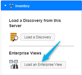
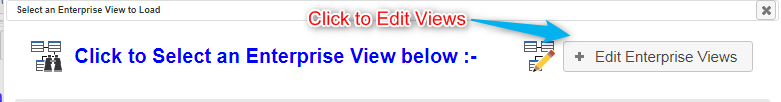
A new button Load an Enterprise View accesses the new Enterprise Inventory Explorer. Clicking on this button opens the Select Enterprise View user interface as below: –
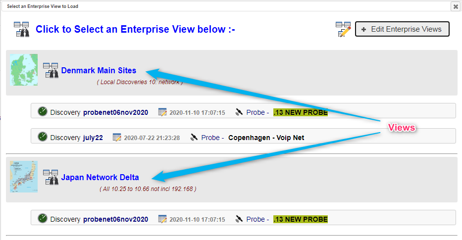
Two Enterprise Views are defined above, ‘Denmark Main Sites’ and ‘Japan Network Delta’ with a geographical Map of the two regions. Following the Enterprise View entry are individual Discovery entries. The Discoveries can be on any Remote Probe and/or the local Enterprise View Manager. There is no limit to the number of Views and no limit to the number of Discoveries per View. The Views and Discoveries can be used in ANY combination.
The Selected View controls the user interface Inventory Explorer content by displaying the Discoveries attached to each View. This means the Probes can work in parallel to deliver multiprobe and multi- Discovery content fully automatically.
Simply click on the desired View, to get to examine the Discovered Inventories of the selected View.
Below is the initial screen after clicking on a View.
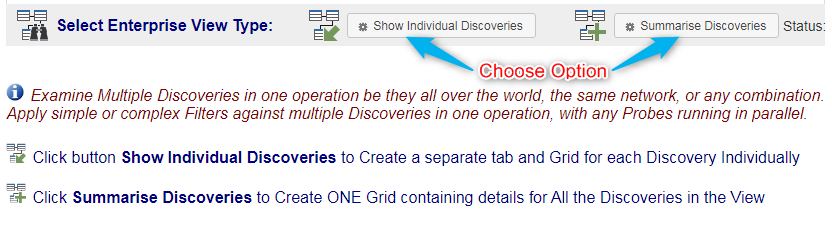
As per instructions, simply click one of the two buttons to kick off the Analysis type, at any time, swap between the modes, at any time.
Individual Discoveries Mode
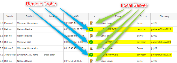
Clicking on the Show Individual Discoveries button, kicks off loading a Grid/Tab per Discovery in the selected View as below. The first tab is a Discovery on a remote Probe.
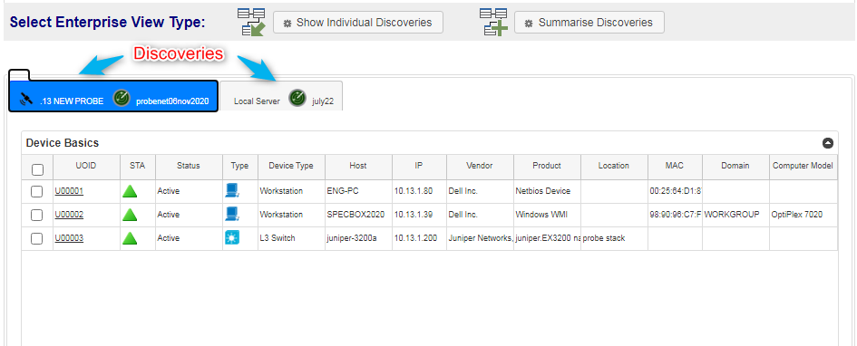
By clicking on the second tab a Discovery from a local Probe is shown.
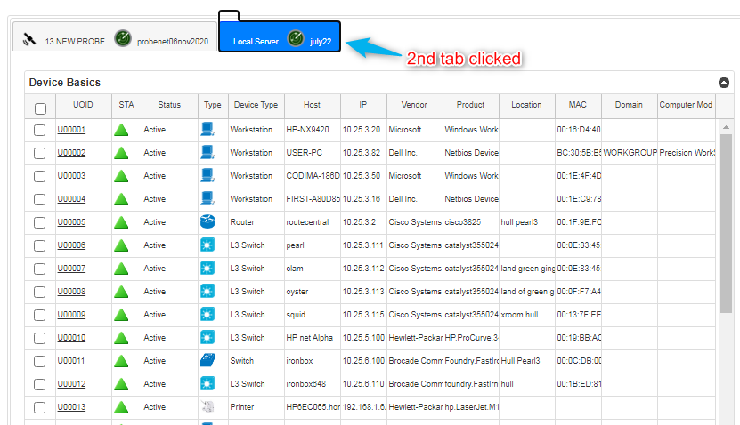
The user created View defines what Discoveries are shown in this feature, there is no upper limit to the number of Views or the number of Discoveries in a View. Discoveries on Probes are processed in parallel by the Probe, making the system totally scalable. Full Analytics are available per individual Tab, which is one Discovery.
Discoveries Summary Mode
Clicking on the Summarise Discoveries button, kicks off creating a combined analysis of all the Discoveries in the View.
Since this is a complex process involving Discoveries from Distributed Probes and Local Systems, status indicators show progress per Discovery.
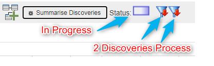
Above two Discoveries are Processing extracting the requested details and apply potentially complex filters.

Above the 2nd Discovery is now building the Combined Database of all the Discoveries. The first Discovery is still processing.
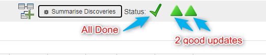
The job is done successfully, both discoveries are processed and combined.
There is now a single Grid which shows the results of the two discoveries in this example.
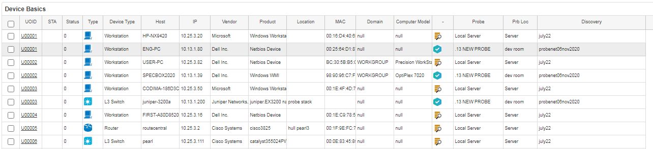
The combined results of the two discoveries are now in one grid. Below there is a zoom in to the Discoveries and Probe columns.
This combined Discoveries grid can now be Sorted, Searched and Exported as normal, showing results from any number of Discoveries, anywhere in the world in one report.
Analytics
For the Summary Mode where discoveries are combined, then new Graphing Options are available.
New options are available to compare Discoveries and Probe-Discoveries in one Graph or multiple Graphs.
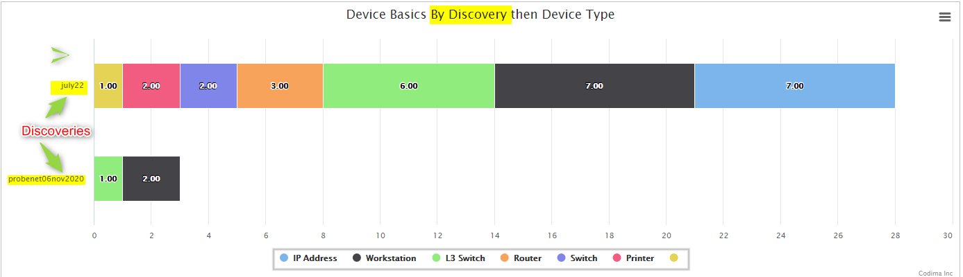
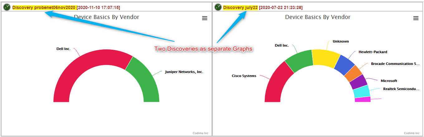
Below is a single graph showing two Discoveries with counts of Devices Types in each Discovery.
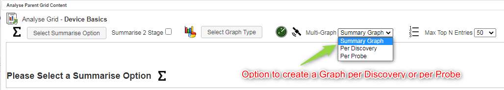
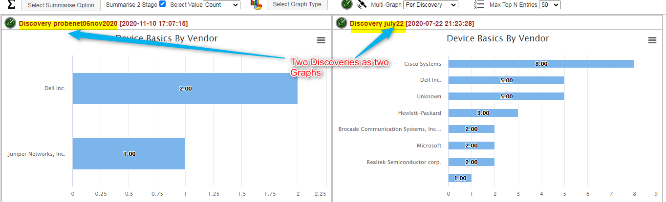
There is an option to create a graph per Discovery or per Probe:
A multiple Graph option is selected to produce these graphs.
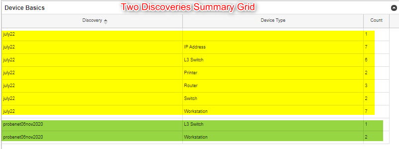
Grid Format can be selected to produce Grids of Multiple Probes and Discoveries (with CSV Export of course). The grid section in yellow is from one Discovery and in green for the other Discovery.
Creating and Editing Views
Following a first Product Installation there are no Enterprise Views. These must be created by the User to match their own environment of Network Discoveries. This is a very simple process and any number of Views can be added.
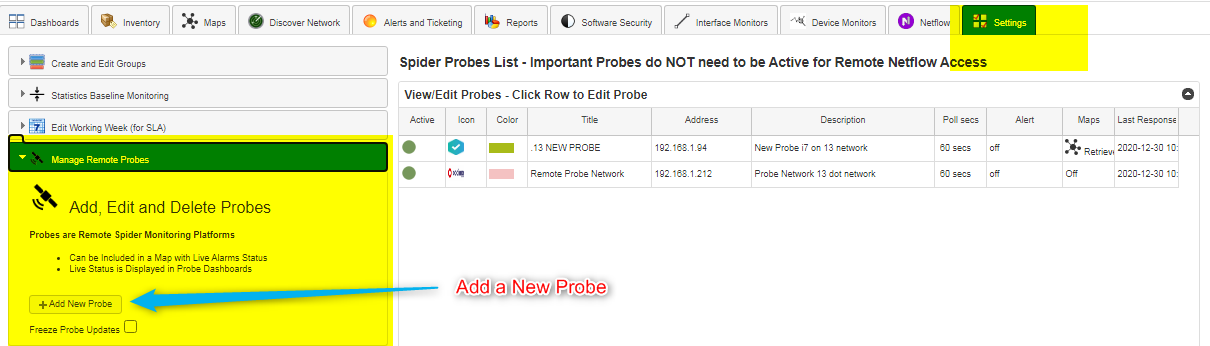
Probes can be added under the Settings Tab as below. To add new Probes only takes a couple of minutes. Good to choose short and concise Probe Titles and meaningful Icons.
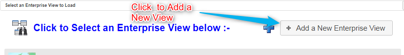
Adding New Views
To add a new View then the View Edit Mode has to be selected by clicking as below:
Now a new View can be added:
After clicking Add a New Enterprise View a dialog appears to enter the View details.
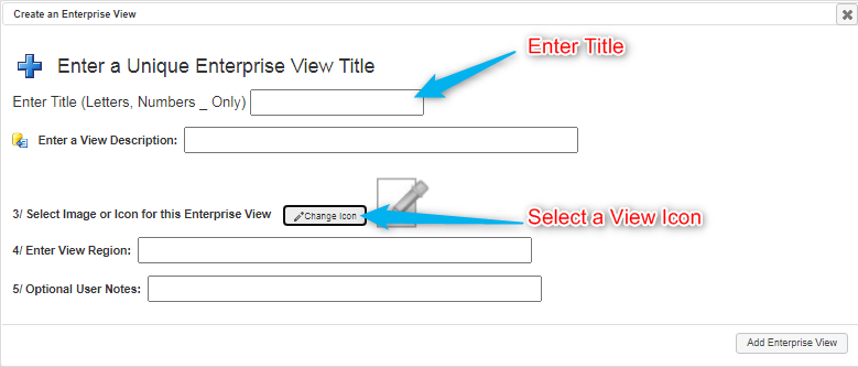
It is mandatory to enter a unique Enterprise View Title, and highly recommended to add other details especially an Image for the view as below:
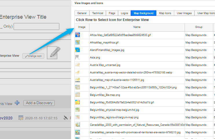
There is a list of maps supplied by Codima, but the user can use their own map images too.
The next job is to enter Discoveries to each View.
A single view is shown below: –
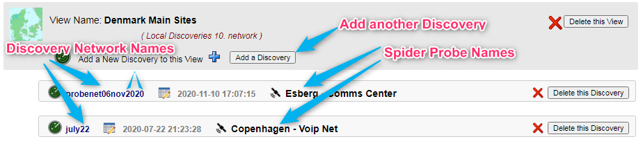
This View has two Discoveries attached which are using two different Probes, in this case. Discoveries can be all on the local Manager, all on Probes, or any combination whatsoever.
For example, a view could be used to combine two or more Discoveries on the local Manager, or two or more Discoveries on a Remote Probe, or any combination thereof. This is useful to combine multiple Discoveries from different Subnets on the same network.
Any number of Discoveries can be added to a View by clicking on the Add a Discovery button to launch the GUI below:
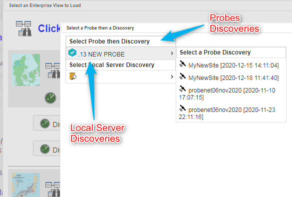
Discoveries can be added from the Local Server Menu list or the Remote Probe Discoveries list – automatically set up by the Manager when it talks to Probes.
Note: Discoveries are retrieved from Connected Remote Probes when the Browser is Refreshed, they are stored and can then be accessed even when a Probe is no longer connected.
Web Map Highlights
It is a frequent requirement to want to see changes in a map between Historical Discoveries. This has been addressed in Map Device highlights for New Devices and a list of Missing Devices presented as a list.
The Web Map Search and highlight uses advanced search options like true wild cards and REGEX. Three independent highlights are offered to show different match classes on the same map.
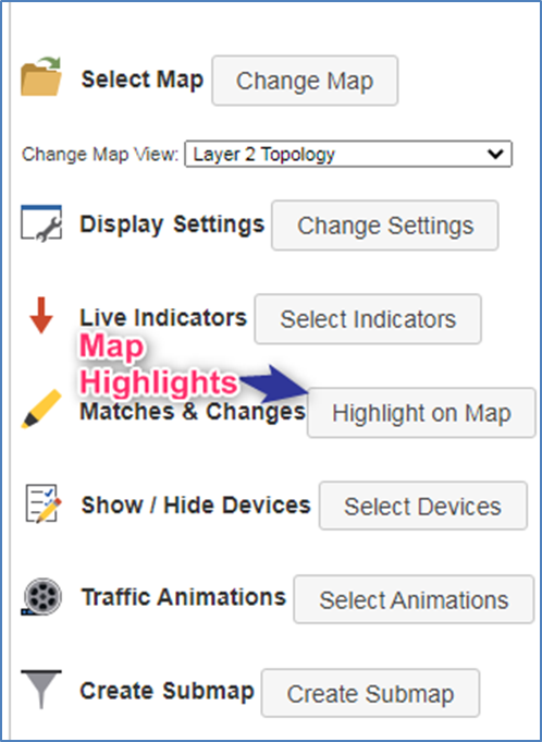
Both features are accessed through the Web Map main options panel as below:
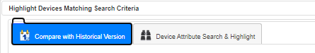
Either Compare Historical Maps or Search for matching nodes which can be selected using the Tab below:
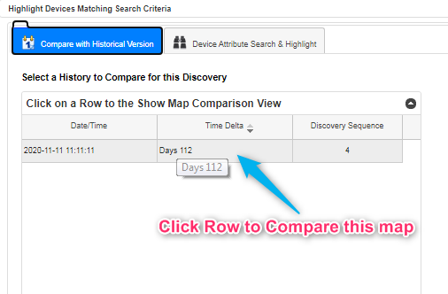
Comparing Historical Maps
Select the Compare with Historical Version tab to get a list of Maps from the SAME DISCOVERY with different Sequence Numbers and Discovery Dates. Now Select a row from the grid.
This other map will be loaded, and then a Comparison Map will be displayed. The New Devices are highlighted with a dotted magenta circle as below:
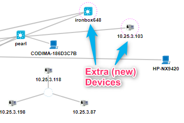
Additionally, devices that are not present any more are listed above the map.

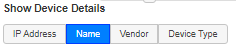
Details are controlled by the Show Device Details under Display Settings in the main map control Panel.
Highlighting Devices using Match Specifications
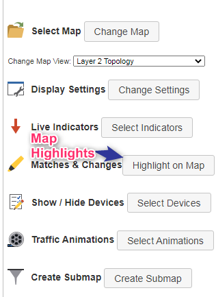
From the Web Map panel click the Matches & Changes button.
The map search options appear as below.
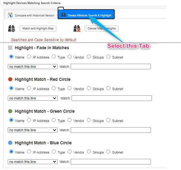
Multiple searches can be set up at the same time.
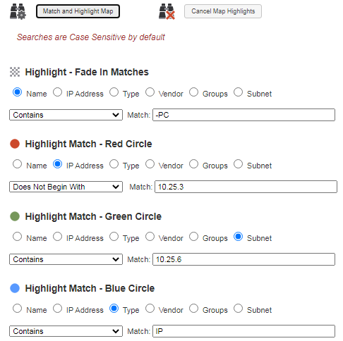
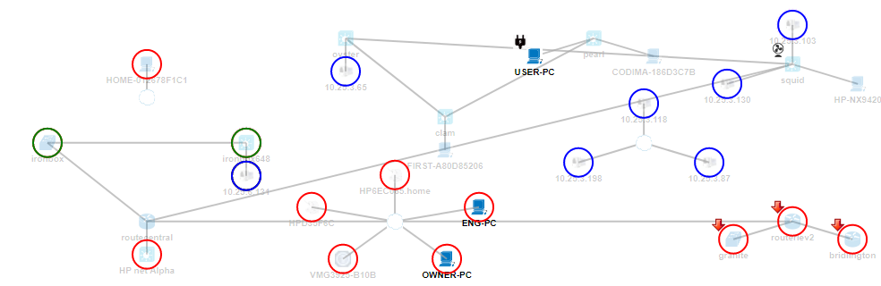
In the example map below, only devices beginning with ‘IP’ are not faded out.
Devices not in IP prefix `10.25.3’ are circled red.
Devices in Subnet ‘10.25.6’ are circled green.
Devices Type ‘IP’ are circled blue.
Inventory Explorer Analytics
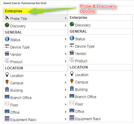
By clicking on the tick box below an extra level of analysis is available.
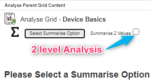
When clicking on the Select Summarise Option button a layer of options appears as below: –
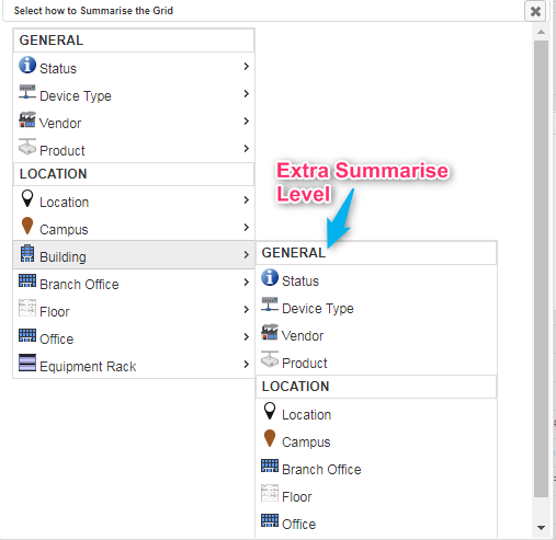
Any combination can be selected (duplicates are automatically removed from the second list).
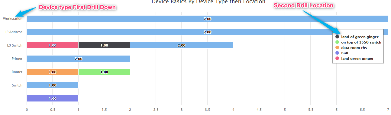
A stacked Bar Chart shows two dimensions of the Summarisation, by Device Type then Device Location.
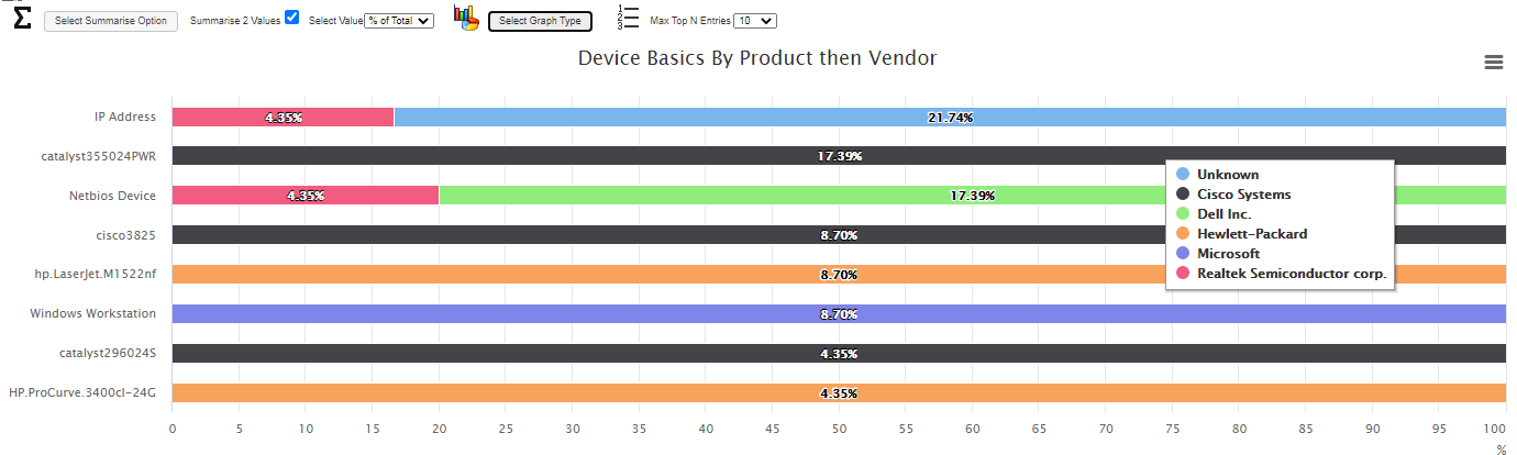
There are numerous options available with all the ITIL and Discovered metrics in any combination.
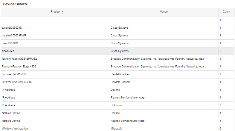
The two-level analysis can also be displayed as an interactive Grid, that is sortable, filterable and exportable: –
The order of summarisation can easily be swapped by reversing the First and Second drill selections.
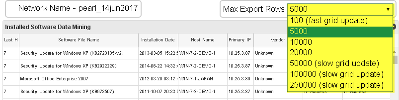
Data mining Grid Maximum Rows Control
It is possible to select how many rows are loaded into the Grid view. This is important as it controls the number of rows that can be exported to a CSV file. The option is highlighted in yellow below.
Settings
This is accessed by clicking on the icon as below:

Maximum Grid Rows
Currently the settings allow the creation of User Customisable fields in the database and also control the maximum rows in the main report grid.
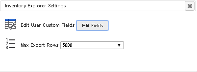
The maximum number of rows in the Main Grid can be set. Note, a very high value will slow the time it takes for the system to populate the grid. The maximum rows selection also sets the maximum number of rows that can be Exported or Printed from the Grid.
MAPS Feature
Toolbox Map
A straightforward Interface that allows all functions from one GUI, this allows direct mixing of all edit, display, and animation features. Maps are created automatically by doing a Network Discovery.
Shown below is a Map with the Navigator tab selected.
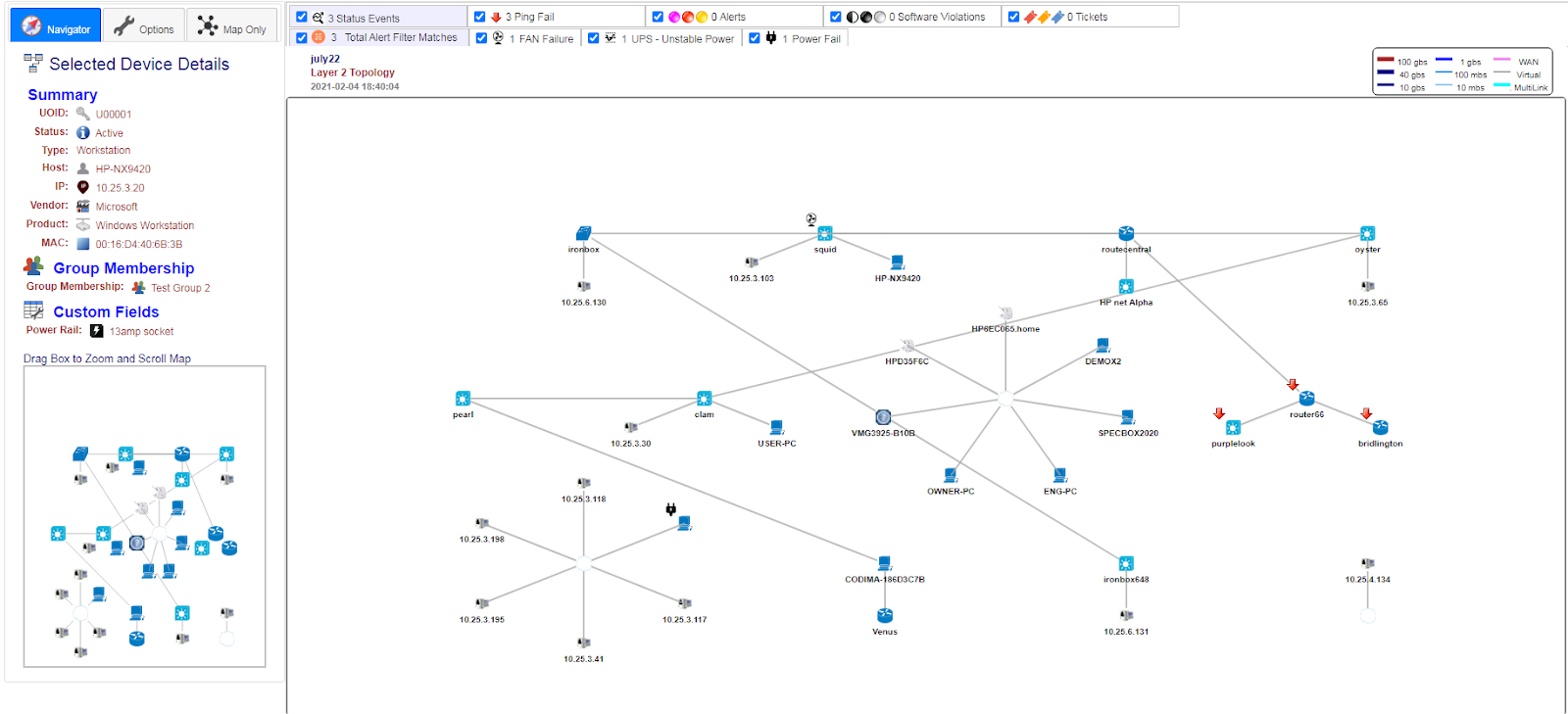
Note there are three tabs (Navigator, Options and Map Only) showing when viewing a web map using the Maps Tab.
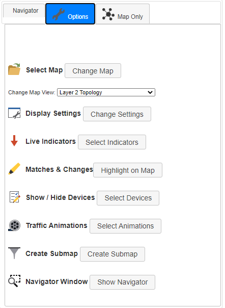
Above the Map Options tab has been selected and is showing the Options panel, which allows maps to be selected. A range of facilities to control how the Map is displayed can be selected.